Color Temperature in Architecture and Space Perception
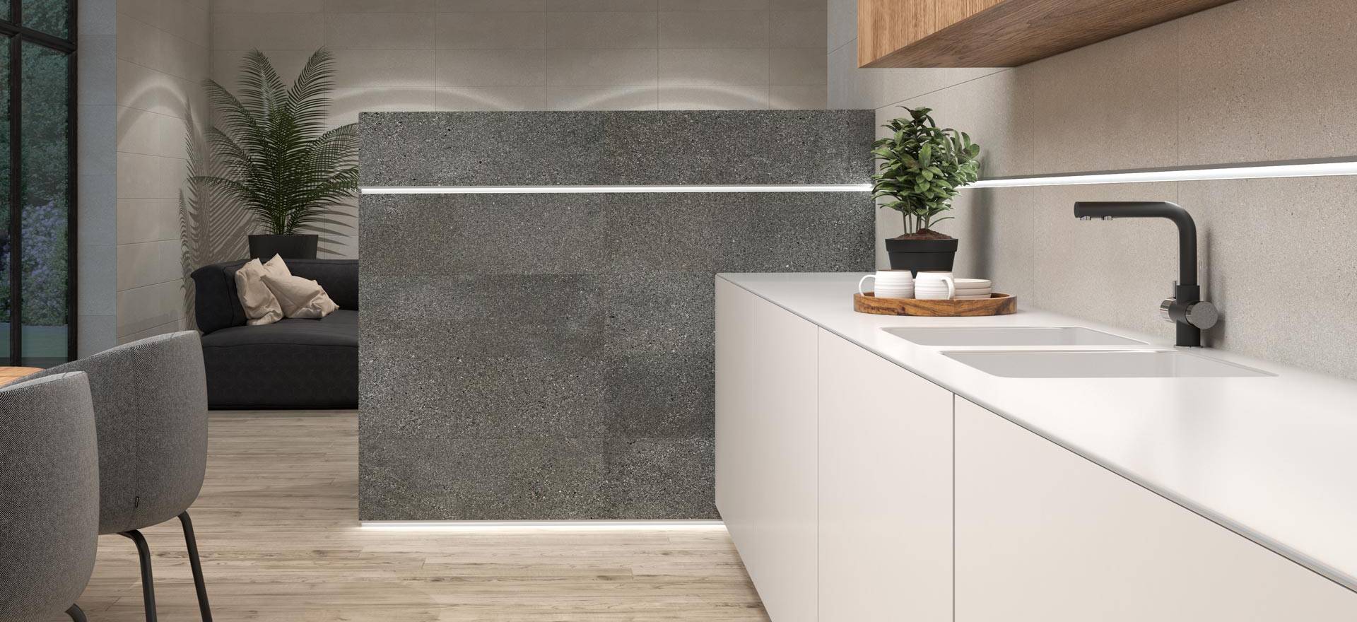
Choosing color in architecture and interior design goes far beyond aesthetics. The colors we use can alter the perception of dimensions, reinforce certain sensations and change the way we understand the materials and volumes within a space.
Moreover, color is never perceived in isolation. Its appearance changes depending on the light, the surrounding colors, the texture of surfaces and the materials alongside it. This principle is particularly relevant in architecture, where every element forms part of a broader composition.
At EMAC® Group, we work precisely at these meeting points between materials, which is why the relationship between color, context and construction details is a natural part of the way we approach a project.
Warm and cool colors: a classification that depends on context
Color temperature allows colors to be broadly grouped into warm and cool categories. Reds, oranges and yellows are usually associated with warm colors, while blues, greens and violets are generally considered cool. However, this division is not absolute. The same color can be perceived differently depending on the colors surrounding it. Violet, for example, may appear warmer next to blue and cooler next to certain shades of red.
For this reason, in design and interior design it is more useful to think in terms of color relationships rather than fixed rules. Color acquires meaning within a composition, and it is precisely this relationship that allows it to be used strategically.
How color influences the perception of space
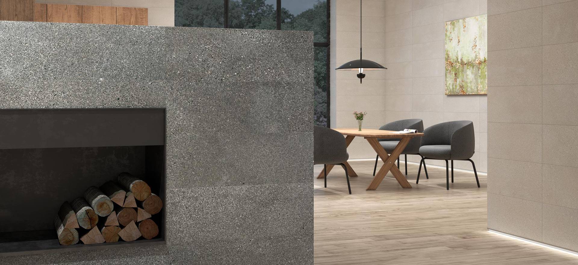
One of the most interesting effects of color is its ability to visually alter the perception of dimensions. Under certain conditions, light and cool colors can help create a greater sense of depth or spaciousness. Warm, intense or dark colors tend to have a stronger visual presence and can make certain surfaces appear closer.
This can be useful in small spaces, passageways or particularly large rooms where a more intimate atmosphere is desired. In any case, color never acts alone. The orientation of the space, the amount of natural light, the type of artificial lighting and the proportions of the surfaces always influence the final result.
Visual weight is also part of the design
Color can be used to create hierarchies within a space. Darker or more saturated colors tend to attract more attention, while lighter colors are generally perceived as visually lighter. This difference can be used to highlight volumes, create contrasts or visually balance a composition.
In architecture, this concept is not limited to walls or ceilings. Flooring, wall coverings, wood, metals and finishing elements also contribute to the overall perception of color.
A profile, for example, can blend almost seamlessly into the finish to provide design continuity or become a visible line marking the transition between materials. It is a small-scale decision, but one that can influence the final perception of the space.
Color, light and material should be considered together
Choosing a color from a small sample may not be enough to anticipate how it will actually behave.
Natural light changes throughout the day, while artificial lighting can significantly alter the perception of colors. Likewise, a glossy surface reflects light differently from a matt one, and a metallic finish can introduce nuances that do not appear in other materials.
For this reason, during the design phase, color should be considered alongside the other variables that shape the space: lighting, texture, finish, scale and its relationship with surrounding materials.
This integrated approach helps avoid isolated decisions and allows the overall composition to maintain greater coherence.
Color is also part of the construction detail
When developing a color scheme, attention is often focused on the major elements of the project: flooring, walls, furniture or coverings. However, the final result also depends on how the junctions between these elements are resolved.
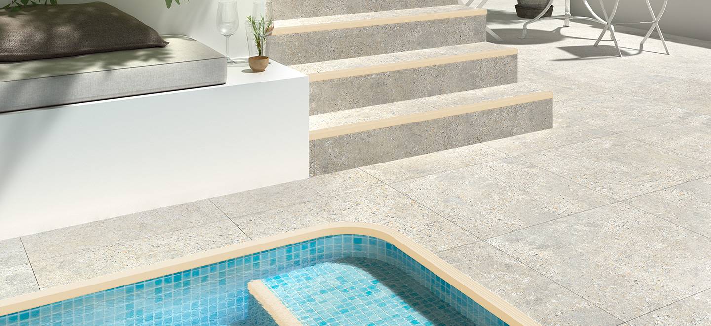
Skirting boards, profiles, transitions, finishing elements and stair nosings can subtly complement the color palette of a space or introduce an intentional contrast.
At EMAC® Group, we develop solutions specifically to resolve these junctions, combining technical functionality with design. The choice of finish, material or color can help integrate the solution into the project or, when desired, turn it into a visible part of its aesthetic language.
Ultimately, working with color in architecture means understanding relationships: between colors, materials, light and surfaces, as well as between the different elements that construct a space. When all these decisions are approached coherently, color ceases to be an added layer and becomes an integral part of the project from its conception.